Working on a new model
A few days ago I started working on improving Normalin's model.
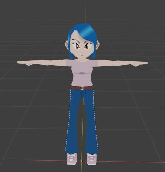
At the beginning phases of this project I was going for a PS1 retro like aesthetic. I liked the aesthetic for nostalgic reasons, but it was also a lot easier to draw stuff myself. Unfortunately this style isn't very popular, so I made a change of plans and started working on "modernizing" the graphics.

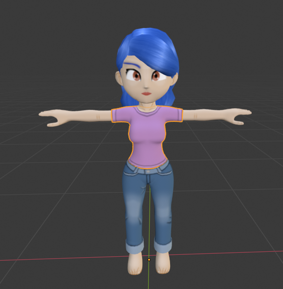
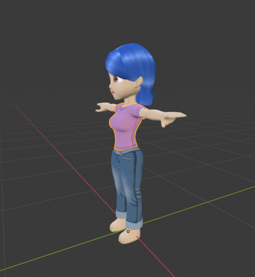
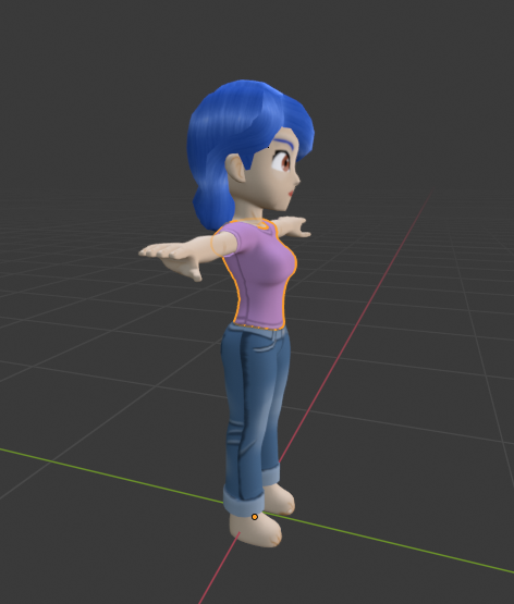
What I did was find a nice base mesh similar to the style I was going with. The base mesh had a very good shape, and just the right amount of detail to do the job. I then had to redraw new textures for the face, and skin. Finally I created a much more defined hair model. The hair texture I used was part of a free texture pack by ebonykun @ deviantart (https://www.deviantart.com/ebonykun/art/Hair-Texture-Pack-730516486).
Additionally I started working on the clothes and their texture. Getting their shape wasn't too hard, since they were basically copies of the torso and legs, but with slight alternations. The textures are hand drawn (by my hand) and stylized. They're not super detailed but I think they work.
Here is what the model looks like now:


I'll be working on the shoes next. And after that I'll be creating the alternate clothing options one by one.
If you have any suggestions let me know down below on the comment.
Normalin Run
Normalin Runner
| Status | In development |
| Author | Ponti Kue |
| Tags | 3D, bondage, bondage-fetish, Casual, damsel-in-distress, Female Protagonist, kinky, Runner |
| Languages | English |
More posts
- Normalin Run Post MortemDec 26, 2020
- Progress ReportSep 21, 2019
- Restraints Modeling Progress (Part1)Sep 11, 2019
- Animations Part 2Sep 08, 2019
- Animations Part 1Sep 07, 2019
- Outfits Created (Technically)Sep 05, 2019
- Better ObstaclesSep 01, 2019
- Improved EnvironmentsAug 30, 2019
Comments
Log in with itch.io to leave a comment.
I kinda like the old model but the new one looks great. An option to use the older one would be nice, if it's not going to be too much work to work the 'equipment' for both models.
As a side note, I had a thought. We can't really see the gags and blindfolds etc on Normalin during the game. Perhaps an option for window in window that shows her face during gameplay?
I appreciate that you like the old model, especially since it was 100% handcrafted by my own hands. But unfortunately not many people share your sentiments. Also keeping both models will be quite difficult. They are very incompatible so I would have to create two sets of restraints and outfits.
As for your side note: I agree completely. I was aware of the problem from the start of developing Normalin Run, and have tried several ways of fixing it.
Firstly during the alpha version I planned to have a camera view that showed the front of Normalin (think of the boulder chase level in Crash Bandicoot). But that proved to be very bad for the gameplay, as it was very difficult to predict where obstacles popped up next. Pulling the camera back was also a bad idea, since it made it harder to discern the stuff Normalin was wearing (basically defeating the purpose).
The image above is a recreation of what the view looked like. I couldn't find an old enough backup that had the original view
Then I changed the view to a more traditional runner style game, but included a small "mirror view" on the top of the screen (similar to what you suggested actually).
This worked well until my play-testers and I found that it was hard to estimate the depth with that view. The only way to fix something like that was to make the camera a bit more top-down.
Once I made the camera top-down the depth problem was solved, but the mirror view became a hindrance as it was blocking the player's view for incoming obstacles. In the end I had to remove it.
This is also a recreation of what I was talking about since I couldn't actually find a backup that stayed with the top view + mirror view. As you can see I even made the mirror semi-transparent to better see the obstacles, but it didn't work very well in the end.
As compensation for this loss I added a full screen "mirror view" at the main menu. However this is only a temporary and clearly not good enough solution to the problem.
Currently I am thinking of implementing some kind of "Pause" function that allows players to rotate around Normalin's model during gameplay, not unlike Super Smash Brothers.
Anyways thanks a lot for voicing your opinion and offering ideas!
I enjoy talking about these things (maybe a bit too much) so If you wanna know more about something specific let me know and I'll write a devlog about it ;)
The new model looks fantastic! I do enjoy the old aesthetic, but graphical fidelity is always a better thing.
The amount of sequential updates you've been churning on the project is astonishing, all things considered, almost to the point where I begin to fear you may end up experiencing some fierce burnout if you keep it up at this pace... Please make sure you don't work too hard, and that you know your limits. Take breaks.
No reason to worry. I'm taking frequent breaks, plus I don't work too hard (at least not all the time).
In any case I'll take a big break after I finally release this project :D